
Enterprise UX- Trucking and Logistics
Overview
Over the last few years, I’ve worked on some very exciting projects for a large trucking company. Unfortunately, an NDA means that I can’t actually upload details here but I’d at least like to talk about my journey and some of what I learned.


Trucking is complicated, so bear with me.
![993 [Converted]-01.png](https://images.squarespace-cdn.com/content/v1/602dbea532c7f10cdc166c65/1614741312754-021HS8WA0512W7PZ3QHK/993+%5BConverted%5D-01.png)
Context
I worked with a rather large team of designers- there’s over 70 of us working in different domains on a large-scale ($500 million, multi-year) moderinization effort. The end goal is to pivot as the largest provider of digital tools for the trucking industry- ultimately increasing optimization and safety for both internal and external users.
I specifically worked in the operations space. Big picture: Users here work on day-to-day operations once an order is received and the shipment is ready for transporation. The users of the product are trying to find the right drivers, the right equipment, the right routes, communicating with the drivers and maintenance crew, and then tracking the drivers as they are on the road.
![1106 [Converted]-01.png](https://images.squarespace-cdn.com/content/v1/602dbea532c7f10cdc166c65/1614740589231-DBGMAO8NFJWZC810YR9K/1106+%5BConverted%5D-01.png)
With me so far?
I want to stress this again- the user’s job is stressful. It’s time sensitive, requires concentration, years of training and there are a ton of external dependincies. There’s Department of Transportation Regulations, weather conditions, traffic, driver needs and expectations, equipment types, HAZMAT requirements… the list is long but you get the point.
What this means is that any solution that meets their requirements has to be robust and holistic. They are extremely capable individuals that are juggling a 100 different things, and they expect their software to keep up.
With all of the context out of the way, here are some of the solutions I’ve worked on:
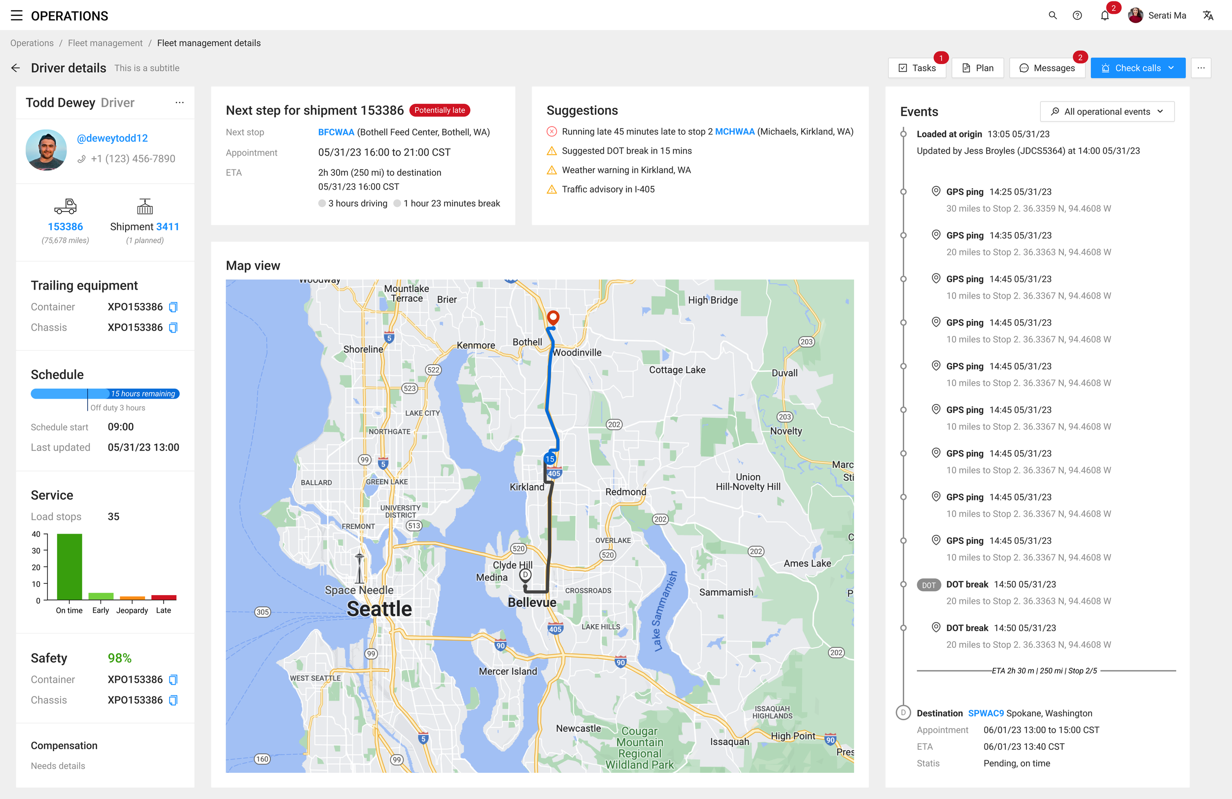
Tracking
This was a large overhaul of an existing page. The original design was essentially a data-dump- imagine a screen with every single data point possible spread out over 5 different tabs. We spent a lot of time on user research, identified key goals and worked really hard on surfacing relevant actionable information; when it actually mattered. We essentially transitioned from a workflow that required the user to parse through lot of information to find things, to a screen that surfaced it in a quick glance. (To the users at least.)
Before
![993 [Converted]-03.png](https://images.squarespace-cdn.com/content/v1/602dbea532c7f10cdc166c65/1614742438745-NDTFOAYHN9AI1VBWHP6R/993+%5BConverted%5D-03.png)
After
![993 [Converted]-04.png](https://images.squarespace-cdn.com/content/v1/602dbea532c7f10cdc166c65/1614742464960-N1FKCCVC0R9HBOGHSSFK/993+%5BConverted%5D-04.png)
Planning
This is my favorite project, by far. The largest business unit- Intermodal (moving shipments using train where possible) had some very specific requirements when it comes to planning. They have employees that are hyper-focussed on planning, either for the same day or for the next day. These users needed a way to quickly find drivers that could carry loads, and they needed to do it efficiently. Both in terms of reducing empty miles and in terms of maximising driver pay. They need to keep they drivers happy and reduce costs.
Load List

Driver View

Calendars
This started out as an idea I had for a better way to surface some data. If the users are trying to fill out the driver’s schedules and reduce empty time, then it follows that a calendar view of some sort might be beneficial. This is an idea that the UX team was married to, we spent weeks polishing it and refining it to make it work for every odd edge case we could think of. The business response to it was.. lukewarm.
They felt the users don’t think in terms of timelines, and we just don’t have the data to support something like this. User testing showed the users agreed with them. The project was ultimately shelved for future consideration, but quite a few lessons were learned. - involve your stakeholders early, sometimes what you think is the perfect design isn’t quite good enough. (Well, maybe not lessons, but really good reminders.)

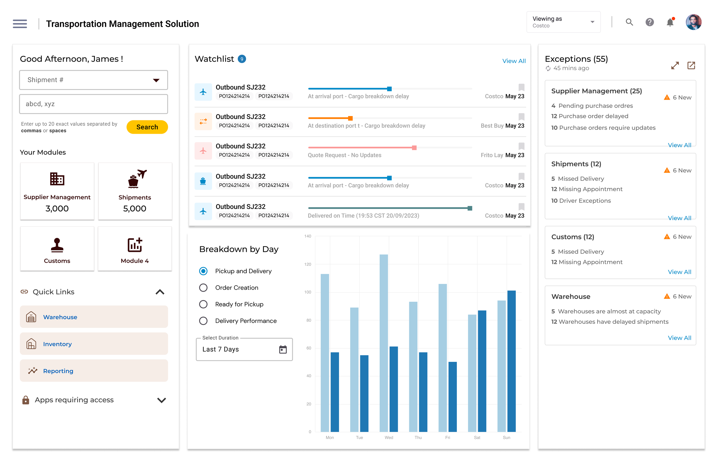
Dashboards
A little bit of fun with data visualization. We had all of these workflows that dealt with specific issues and tasks, but how do we drive users to the right space and alert them about the upcoming problems? This project had two phases to it.
Phase 1: Change the data vizualisation to provide as much insight into a variety of factors as possible within the limitations of PowerBi- Microsoft’s analytics and reporting tool.
Phase 2: Blue Sky- Imagine what a dashboard could be with no limitations.
This was my starting point- a collection of data points that the dev team had read access to.

Phase 1 - After
Version 1: First draft after endless conversations with business and tech, trying to understand why our users need this data and what they plan to do with it.

Version 2, north star: Let’s explore what this could look like if it was more future facing. Let’s create a goal for us to strive towards. Each data element on this screen is though through and is contextual to the user that’s logged in.

Outside the design system
Everything you saw so far was built using the existing, very robust design system. I did do some explorations of what these screens could look like outside that design system though

“Mistakes are made. Lessons are learned.
— somebody on the internet
The way I’ve presented these projects is a neatly packaged bundle. A paragraph long description, maybe an inkling of the process and then a before and an after image. I really wish I could present the entire story here; mistakes were made, multiple course corrections were had and most of these screens had dozens of iterations, some so drastically different that they wouldn’t pass as the same screen.
Ultimately though, the process was similar- try something, test it, watch it fail, improve the things that failed, and repeat. At the center of this process were our users. They dictated, in a particularly significant way, what the final screens looked like and how they worked.